Despite all the talk of social media and other disruptions to traditional marketing activities wrought by recent advances in technology, trade shows are still a big deal in many B2B tech verticals. The trade show industry generated $31.3 billion (U.S.) in 2016 and has seen steady, if modest growth year over year according to Statista.
Our own experience supporting clients at trade shows on three different continents — Asia, Europe
Here
Booth Aesthetic
We aren’t supposed to ‘judge a book by its cover’ but the fact is we humans are pretty much wired to do just that. In fact, on average we tend to form an opinion about what we see in as little as 100 milliseconds. What does this
While the ‘go big or go home’ approach is a tempting road to take, it’s far wiser to pour more resources into the overall design aesthetic of a trade show booth. For instance, at ISC West we saw some booths that were far from the largest on the convention floor, but they looked impressive and inviting.
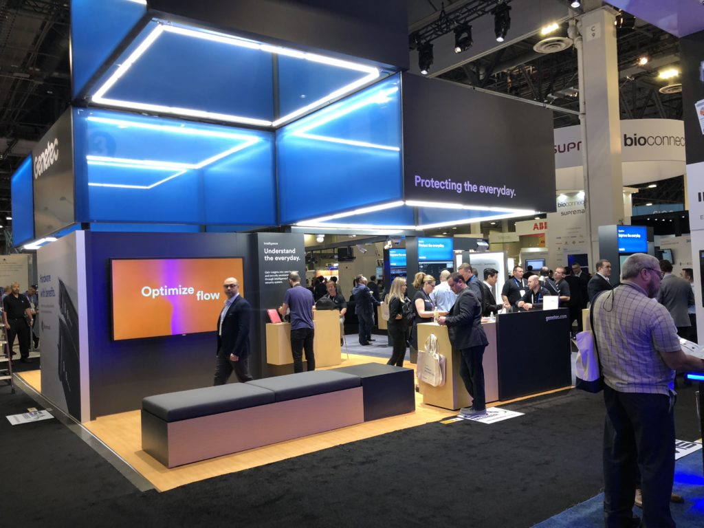 This company’s booth is a good example of taking a minimalist approach. It projects impeccable taste, focuses the attention of visitors on fewer key messages, has great traffic lanes inside, and uses warm colors in the furniture and flooring to make the booth inviting. The video display is surrounded by a black wall, which helps focus attention on the video messages.
To
Since booths are inherently architectural, like little office buildings, every element of
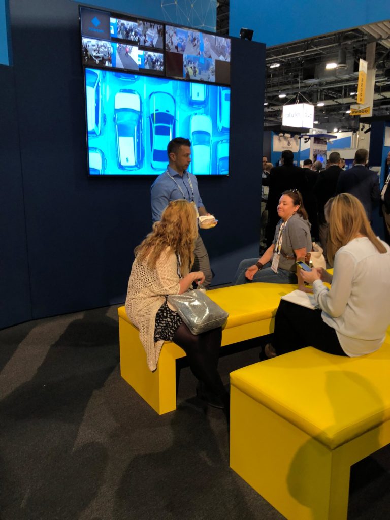
The furniture color selection makes this part of the booth stand out against the darker hues in the carpet and walls, plus lighting adds warmth and focus on the seating area, giving a sense of intimacy in an otherwise crowded environment; kudos for using a carpet with some design elements instead of the boring, run-of-the-mill carpet found in many trade show booths.
Layout Matters
The layout of a booth can have an oversized impact on the way in which attendees engage with it and even the amount of traffic a booth stimulates and ultimately handles. Take the open booth concept as an example. Much of the content of an open plan booth is viewable from the trade show aisle, allowing a company to communicate more information to a larger number of attendees. A closed booth with walls on the outside, on the other hand, allows a company to play with design and wall messaging to draw in the ‘right’ attendees and then create a special customer experience that can feel far more intimate and curated than the wide-
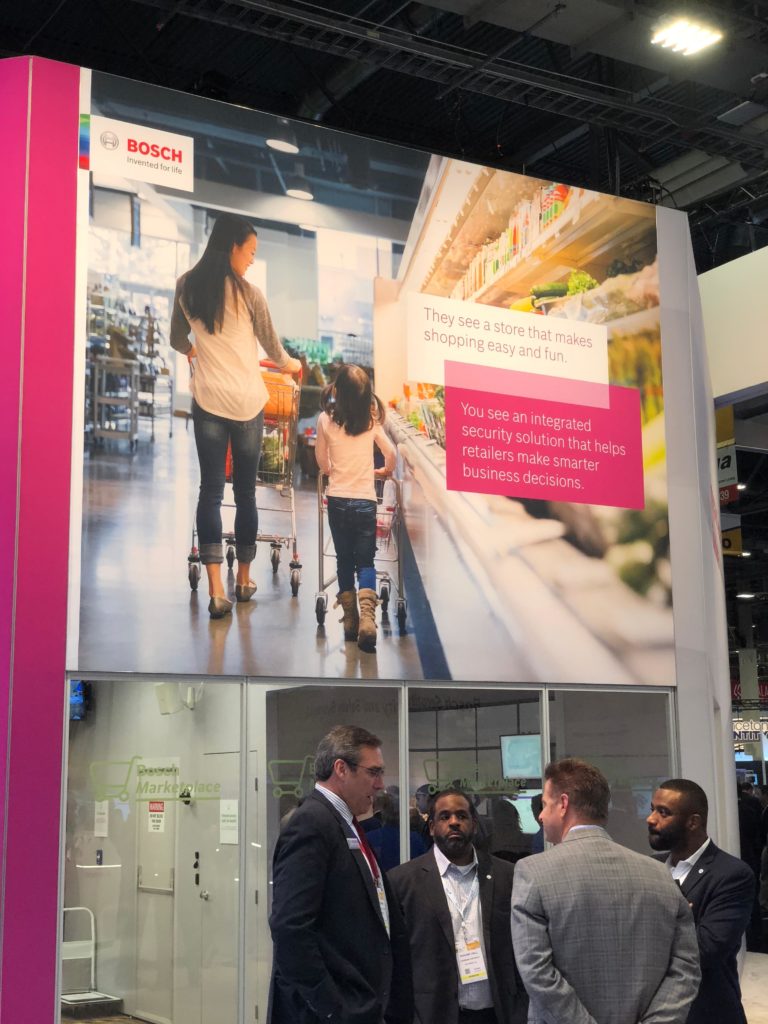
This booth uses angles and a modern design aesthetic to great advantage, projecting an image as that of a market leader. The main focal point in the booth, a picture of a mother and child shopping in a grocery store, adds an important humanizing element to the modern design while at the same time shows that while the technology may be impressive it is still about helping keep real people safe and secure. The booth also requires visitors to step across the threshold to experience the brand and its technology offering; that said, its use of glass walls was a clever way to give it a sense of openness despite the closed-booth format.
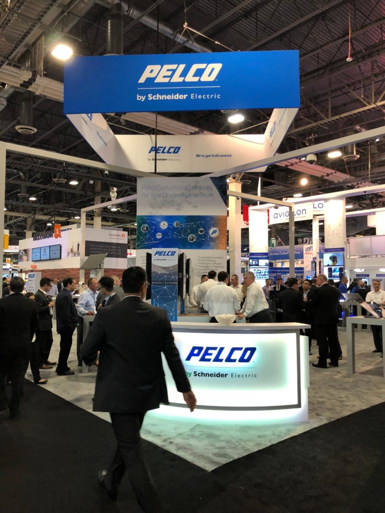
This is an example of the open-booth format that allows trade show attendees to see everything in one glance. It’s open, inviting and easily accessed. The use of blue connotes professionalism and competence. Lighting could have been used to accentuate key messages; toning down some of the wall graphics might allow the key messages to pop more as well. Finally, a little warmth could be added to draw visitor attention to desired location in the booth.
Booth layout should always complement the company’s key messaging. Rather than show a jumbled series of messages about products and offerings with no particular organizational strategy, it’s far more effective to think of the booth as a narrative that can be communicated as a series of different yet connected scenes. Not unlike a Hollywood movie that works with an artist to conceptualize scenes before committing precious resources to
Product Placement
At trade shows,
Where a company places its product in the trade show booth can also impact how much meaningful traffic a booth receives. For instance, a company that places its product on interior walls may see more visitors inside the booth. It converts them from casual observers into interested
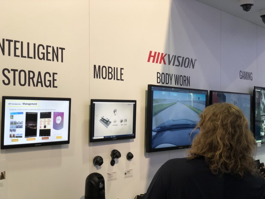
A good example of a booth that places products and solution information on interior walls, which encourages visitors to deepen their engagement with the company. Lighting was put to good use as well, although it was not applied consistently across the wall — a missed opportunity.
By contrast, products sitting on a table on the perimeter of a booth
User Experience
Last but not least, the user experience of the average visitor is the culmination of what a booth ‘feels’ like, how it’s perceived, and ultimately how it will
For instance, a poorly lit and disorganized booth will leave visitors wondering how well the company is run, whether it can make quality products, and how good the follow-up support will be. A stylish-looking booth, however, complete with clearly marked messages supported by straight-forward demos, will invariably enjoy more attention and leave the trade show with more opportunities to follow-up on.
Make sure the booth has that certain ‘je ne sais quoi’ that will appeal to the key buyer personas expected to attend the trade show. Speak their language by addressing their wants and needs, and put on a great ‘live’ experience for them — then make sure your staff is trained up and ready to do business.

